The Alliance Canada Rebrand
Date: 2020-2022
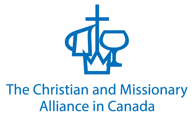
Rebranding The Christian and Missionary Alliance as The Alliance Canada.
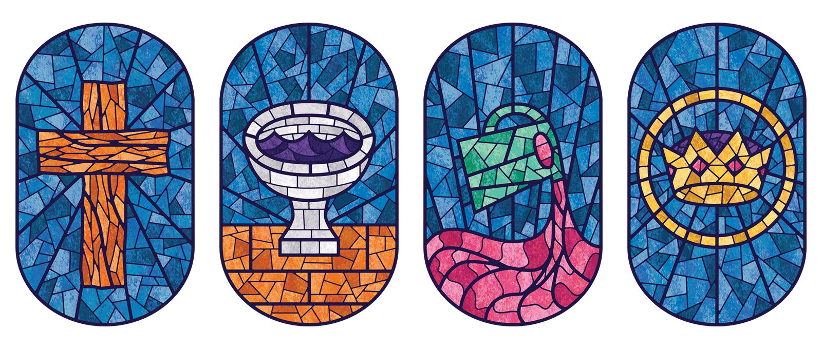
The Alliance was started in the United States by a Canadian pastor. The logomark has evolved numerous times since its inception in the 1890s. The fourfold symbol, the iconography the Alliance uses as its distinctive identity, has been established since the beginning of the movement.
1890's Logo
Early Logo, Date Unknown
1960's Logo
1970's Logo
The Canadian movement became autonomous in the 1980s when it assumed its own visual identity. The U.S. mark was rebranded in the 1990s but the Canadian mark hasn't strayed much from the 1970s iteration.
The brand I inherited
The logo from approximately 2015-2018. The colour and text have changed over the years, but the symbol hasn't been changed. I wanted to preserve the historical imagery, but that alignment bothered me. A lot.
Small changes in 2018 and 2021
My main goals in both sets of updates were to create a better sense of balance, spacing, and weight. For the 2021 update, I adjusted the weight of the strokes to create a better sense of optical balance.
Original
2018

2021

Comparison
The logo evolution from 2015-2021
The new name is easier to read and less of a mouthful to say
We changed the branding to "The Alliance Canada" because most people inside the organization already referred to themselves as the Alliance. Where ever the logo appeared, the text was either too long or too stringy the logo was small.
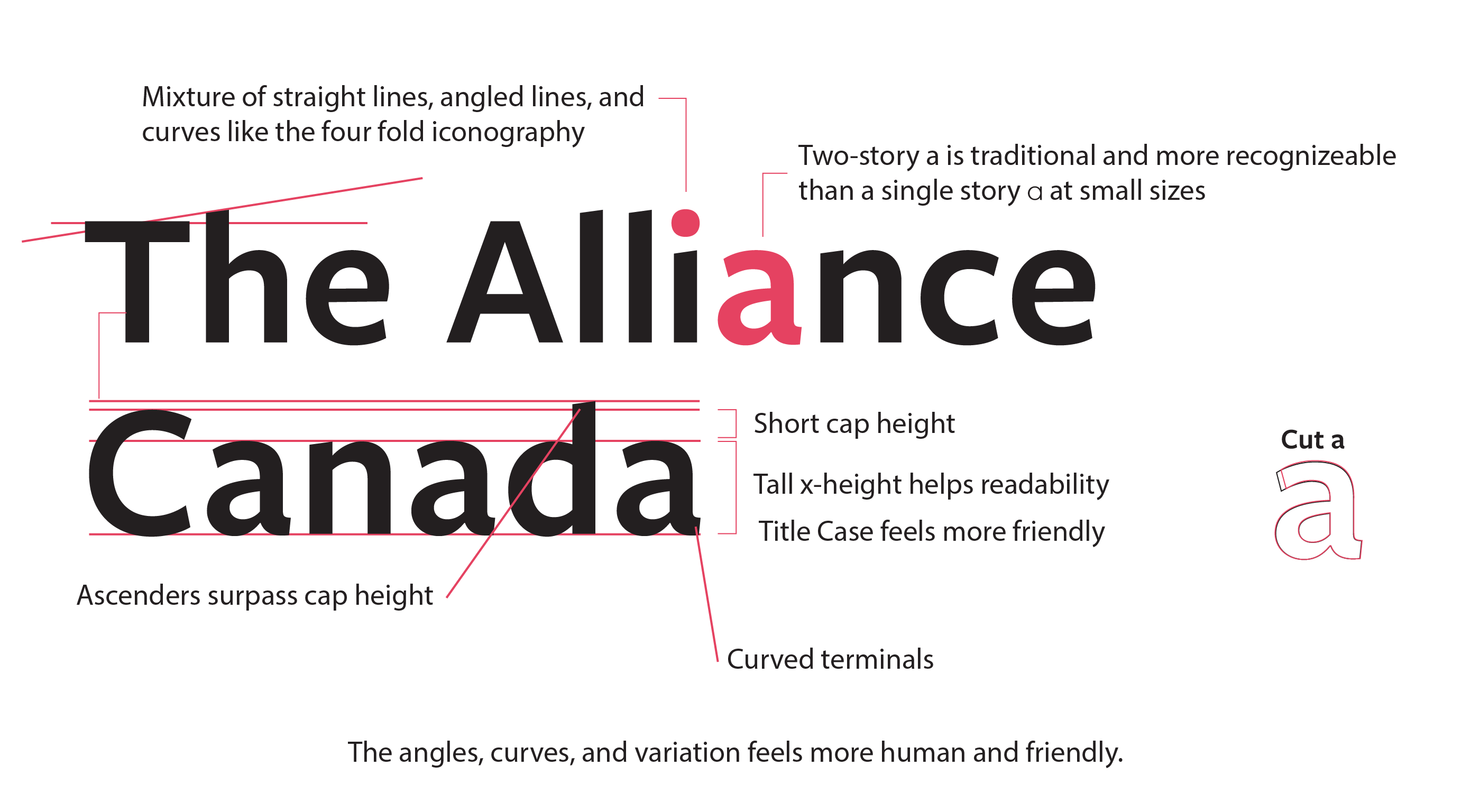
Logo Typography
I chose Freight Sans but slightly modified the lower case "a." The font felt friendly, professional, and worked well on screens. I liked how the font had a mixture of angles and curves that paired well with the fourfold logo.
Brand Guidelines
We changed the branding to "The Alliance Canada" because most people inside the organization already referred to themselves as the Alliance. Where ever the logo appeared, the text was either too long or too stringy the logo was small.
Global Ministries Rebrand
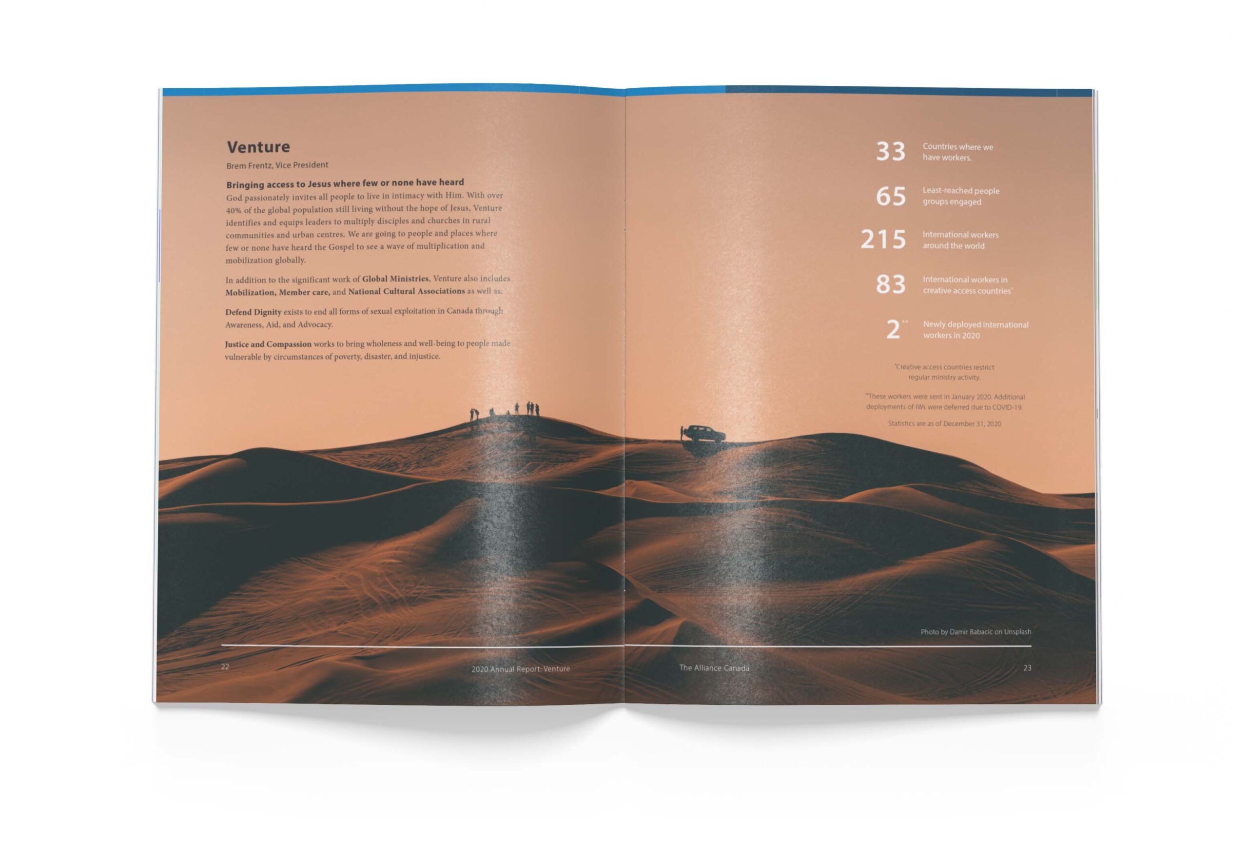
The Alliance sends international workers all around the world. I rebranded the way that The Alliance talks about where Alliance international workers live and work.
2017
2018
2021
Above is the evolution of the branding during my tenure at The Alliance.
The world regions were referred to as the 'Five "S" regions.' Asian Spice, Sea to Sea, Caribbean Sun, Desert Sand, and the Silk Road. The naming scheme created organizational jargon that caused confusion, even with internal stakeholders.
2017 Version
The Five "S" logos were too busy and their names were confusing.
2018 Rebrand
The organization wasn't ready to tackle changing the naming scheme of the regions, but there was agreement that the previous iterations had legibility issues. I was given the green light to update the imagery, so I created the passport stamp style badges with a focus on increased legibility.
2020-2022 Rebrand
In 2020, I worked on updating the branding to both remove the jargon and the colonial undertones from both the names and colours. I based the new region names on the United Nations naming scheme for most regions so that we could be as inclusive as possible in all of our communication.
Europe and Canada don't have sub-regions because they're not a strategic focus for Alliance international workers.
All region badges have a fill and outline version.
Naming system when an international worker wants to show their specific context.
Let's work together
See more projects