Two Gomers PodcastDate: 2023The Two Gomers asked me to rebrand their podcast because they found “Overcoming Runner’s Block” too limiting for the topics they wanted to cover. Original logo for the Two GomersFinal artworkThe process: The podcast was changing from a running podcast to a healthy lifestyle podcast. Steven asked me to create an option that utilized all of their previous podcast names. I made a few options:Option 1Option 2Option 3Option 4Option 5Option 6I really liked the illustrations with their faces because a lot of current podcast art features people, especially in the health and fitness category.Final Artwork: The Two Gomers picked this as their final artwork.Above and beyond: In addition to the final podcast art, I wanted to refresh …
Envision Greenhouse
Envision Greenhouse LogoDate: 2022Envision Canada launched a new initiative for mentoring leaders called “Greenhouse.” I created these while working for The Alliance Canada.The Envision assembled care packages for Greenhouse members using assets I created for Greenhouse, most notably the sticker sheet. It would have had the logo on it, but we actually finalized and printed the stickers before the logo was finished.Who doesn’t love a great rubber stamp? We bought some recycled polymailers and stickers to seal it, but the team decided to stamp them to0! Apparently, the stamps took a long time to dry on the bags. Let’s work togetherName *Email Address *Phone NumberMessage *0 / 500Send MessagePlease do not fill in this field. Please do not fill in …
Dead concept: Greenhouse
Here is a concept I developed for an internal brand within the Alliance. They didn’t pick it but I liked the idea.
They Devoted Themselves
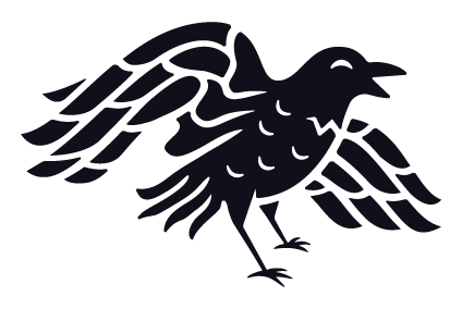
They Devoted ThemselvesDate: 2021They Devoted Themselves is a curriculum developed by Andy Lambkin from Simple Churches for house church fellowships. The name “They Devoted Themselves” comes from Acts 2:42, “They devoted themselves to the apostles’ teaching and to fellowship, to the breaking of bread and to prayer.” These four things are the “ancient rhythms” Simple Churches wanted their churches to orient themselves around.The concept I wanted create a composite image of the four ancient rhythms working together to conceptually represent the Church.Brand GuidelinesLet’s work togetherName *Email Address *Phone NumberMessage *0 / 500Send MessagePlease do not fill in this field. Please do not fill in this field. Please do not fill in this field. Please do not fill in this field. …
The Alliance Canada Rebrand
The Alliance Canada RebrandDate: 2020-2022Rebranding The Christian and Missionary Alliance as The Alliance Canada.Evolution of the rebrandThe Alliance was started in the United States by a Canadian pastor. The logomark has evolved numerous times since its inception in the 1890s. The fourfold symbol, the iconography the Alliance uses as its distinctive identity, has been established since the beginning of the movement.1890’s LogoEarly Logo, Date Unknown1960’s Logo1970’s LogoThe Canadian movement became autonomous in the 1980s when it assumed its own visual identity. The U.S. mark was rebranded in the 1990s but the Canadian mark hasn’t strayed much from the 1970s iteration.The brand I inheritedThe logo from approximately 2015-2018. The colour and text have changed over the years, but the symbol hasn’t …