Neighbourly
Date: 2019
The goal was to create a brand for a peer-to-peer fundraising platform for local and global causes. My team and I named it Neighbourly because we want to be good neighbours to people near and far. Created while working for The Alliance Canada.
Web Designer: Matthew Caldwell
Copywriter: Kristen Parker


Makeup of the mark
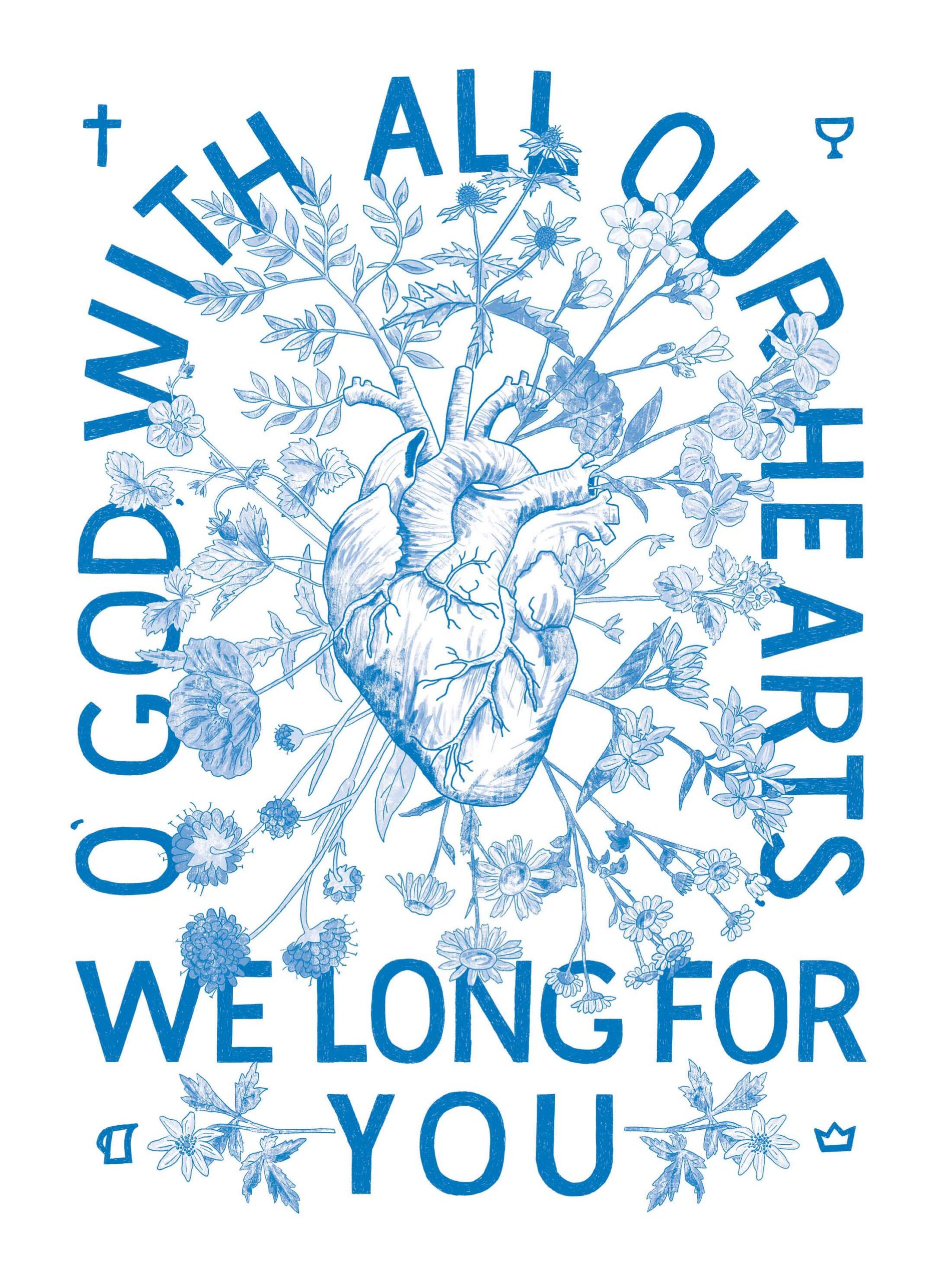
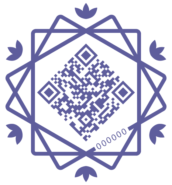
The Neighbourly mark is symbolic of many households overlapping and becoming something bigger than the individual. The flowers represent human flourishing because we want to make the world a beautiful place together. We’ll refer to the icon as “the Neighbourhood” in this guide.


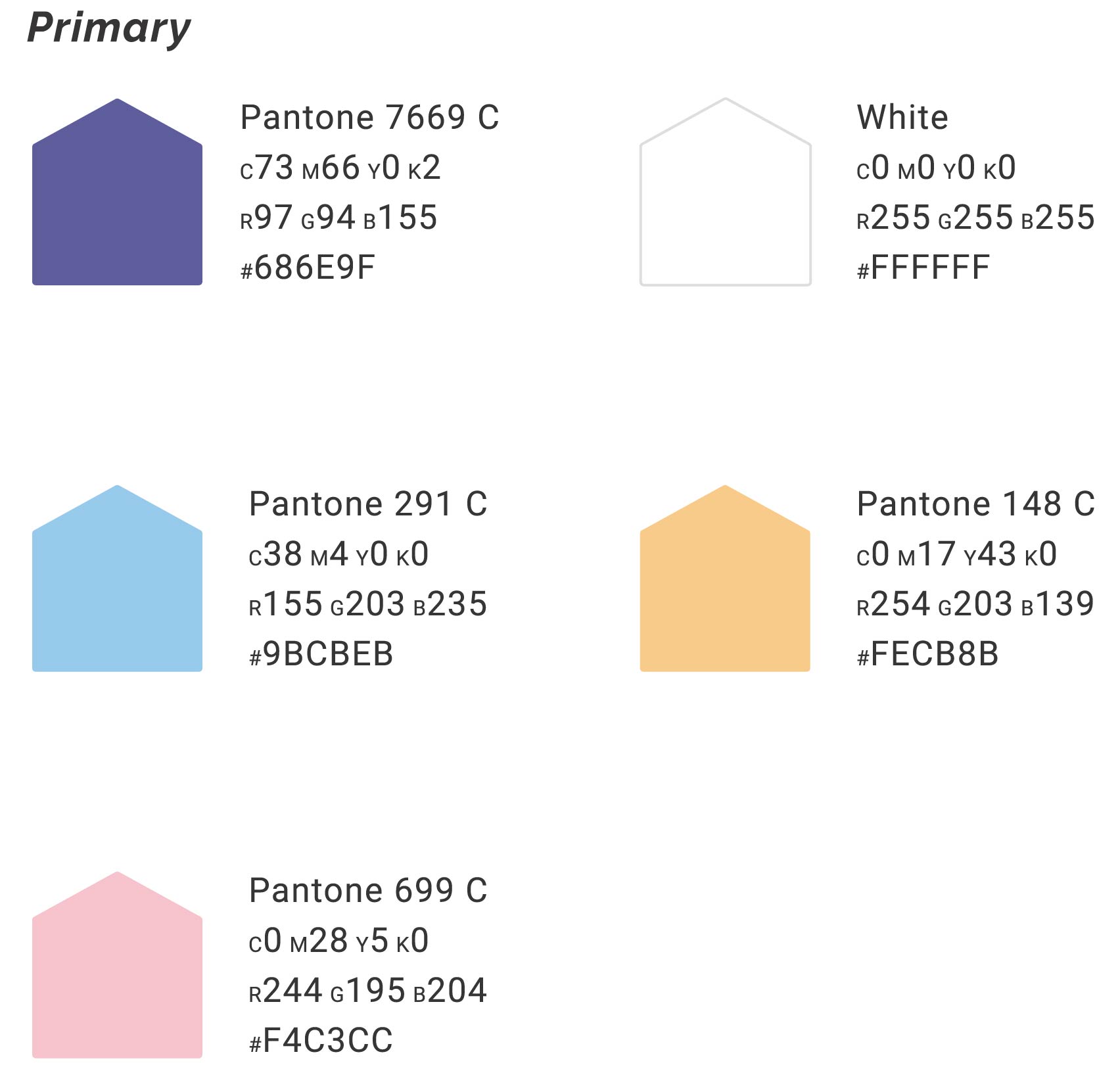
Colour Formulas
Use only these colours for Neighbourly applications.
Picking the colour palette
Research shows that women give significantly more to charities than men, so I created a colour scheme that is welcoming, gentle, and friendly yet not alienating for men either.
A neighbourhood needs neighbours
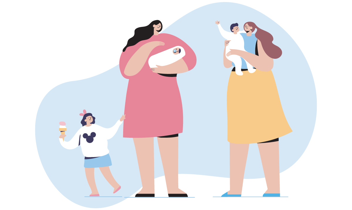
Flat people illustrations are a tech-company fad, but I chose to use people as the main graphical elements because the entire brand is built on the concept of people being compassionate to each other. I bought stock illustrations and changed the colour schemes to be on-brand. As the brand scales, I intend to draw more people in this style and grow the neighbourhood to be more inclusive of age, race, and ability.
QR codes
The Neighbourly mark was designed with QR codes in mind. QR codes can be scanned in any direction, so I orientated it at a 45-degree angle because it reflected the diagonal lines of the mark. It also resembles a neighbourhood baseball diamond, which was a happy accident.
Welcome packet
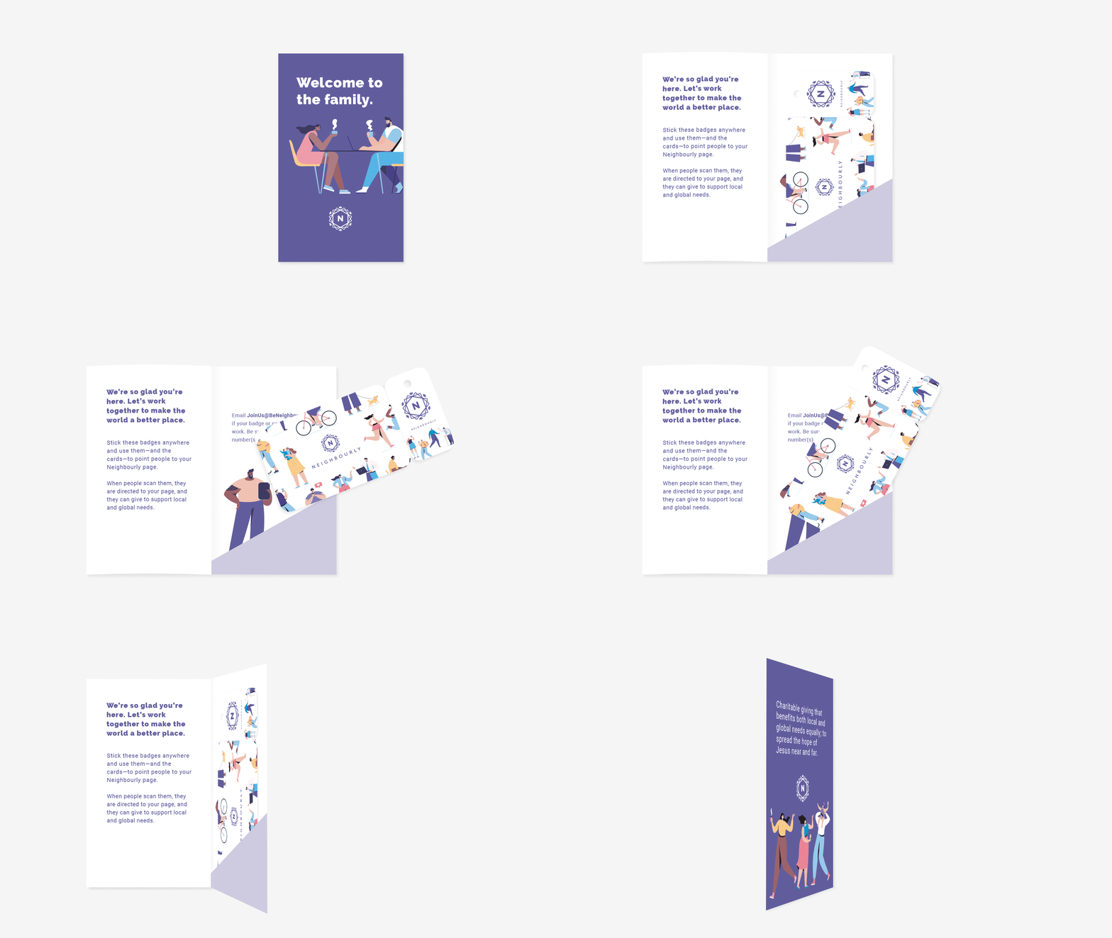
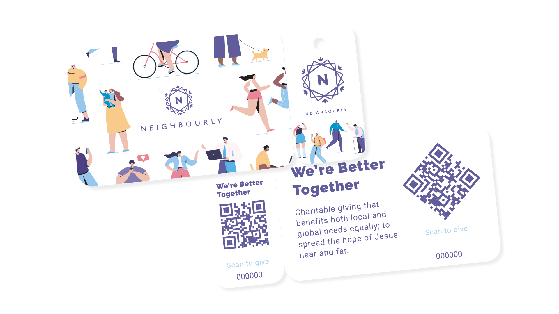
I created a custom folder to introduce people to the Neighbourly program. Everybody receives a few stickers with QR codes and a wallet card and key chain card, all with their own unique QR codes. Three things most people carry on them are a wallet, keys, and a phone; we covered all the bases.
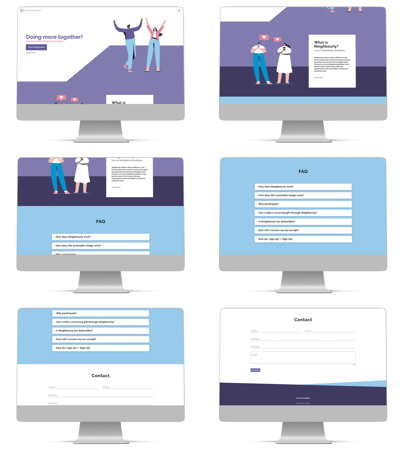
Website
I created layout for the website, beneighbourly.ca for churches to sign up and create their own give portals.
Let's work together
See more projects
