General Assembly Logo
Date: 2019
Every two years the Alliance has a nationwide meeting for official workers called General Assembly. Every two years we had to create a new logo and visual theme and get buy-in using all new branding. In 2020, we created a logo for Assembly that we could use for the next few General Assemblies to maintain brand awareness and spend less time getting buy-in each time. I created these while working for The Alliance Canada.
Concept 1: Hand lettering. People weren't into the A and thought the "ass" was too prominent.

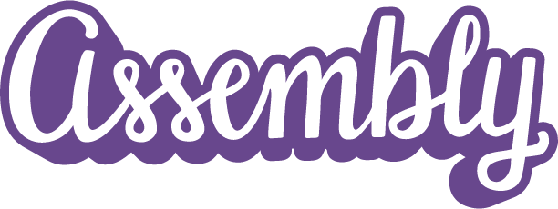
Concept 2: Monoline lettering. People were concerned that Millennials can't read cursive.


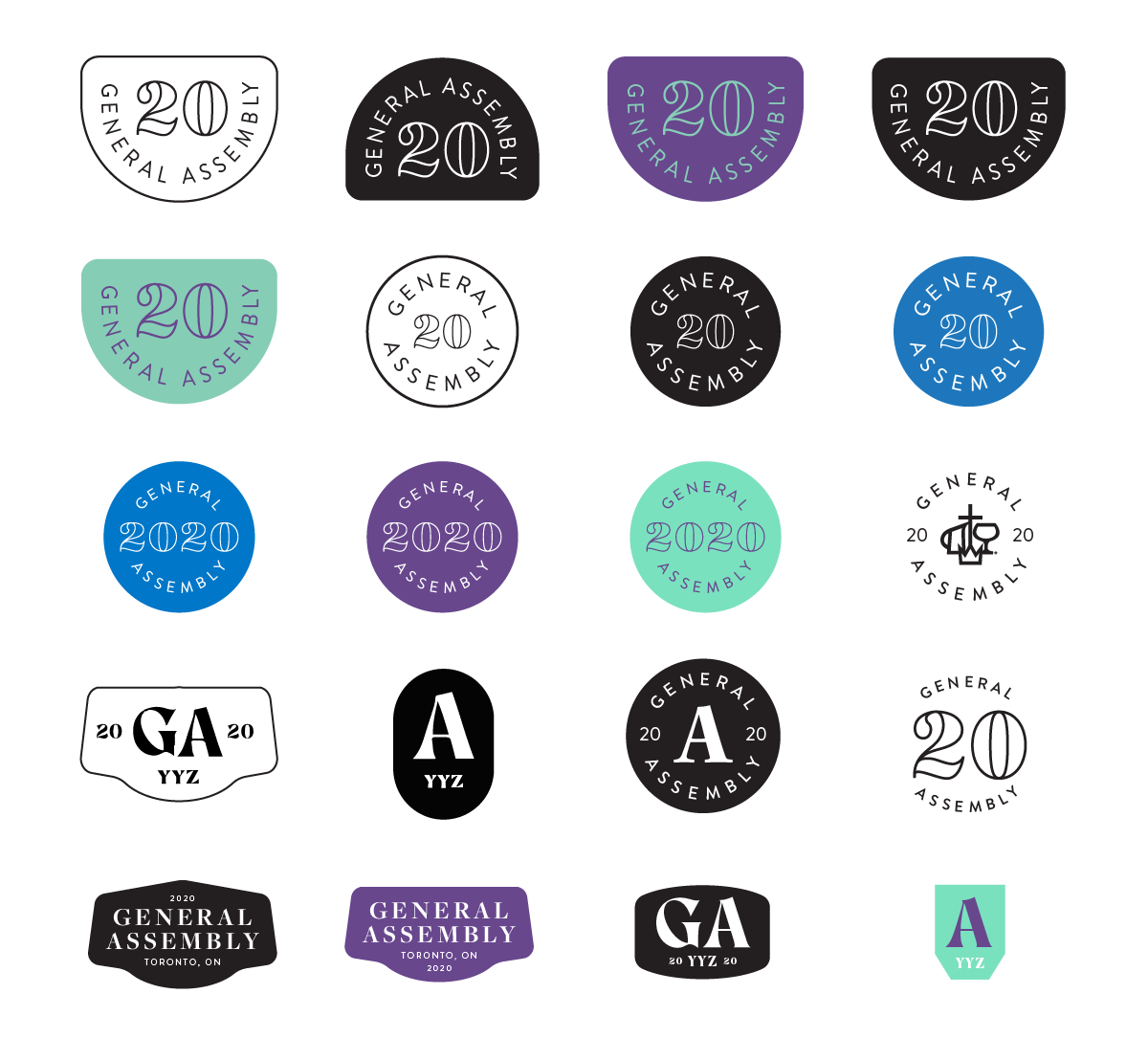
Concept 3: Badges
Approved Concept
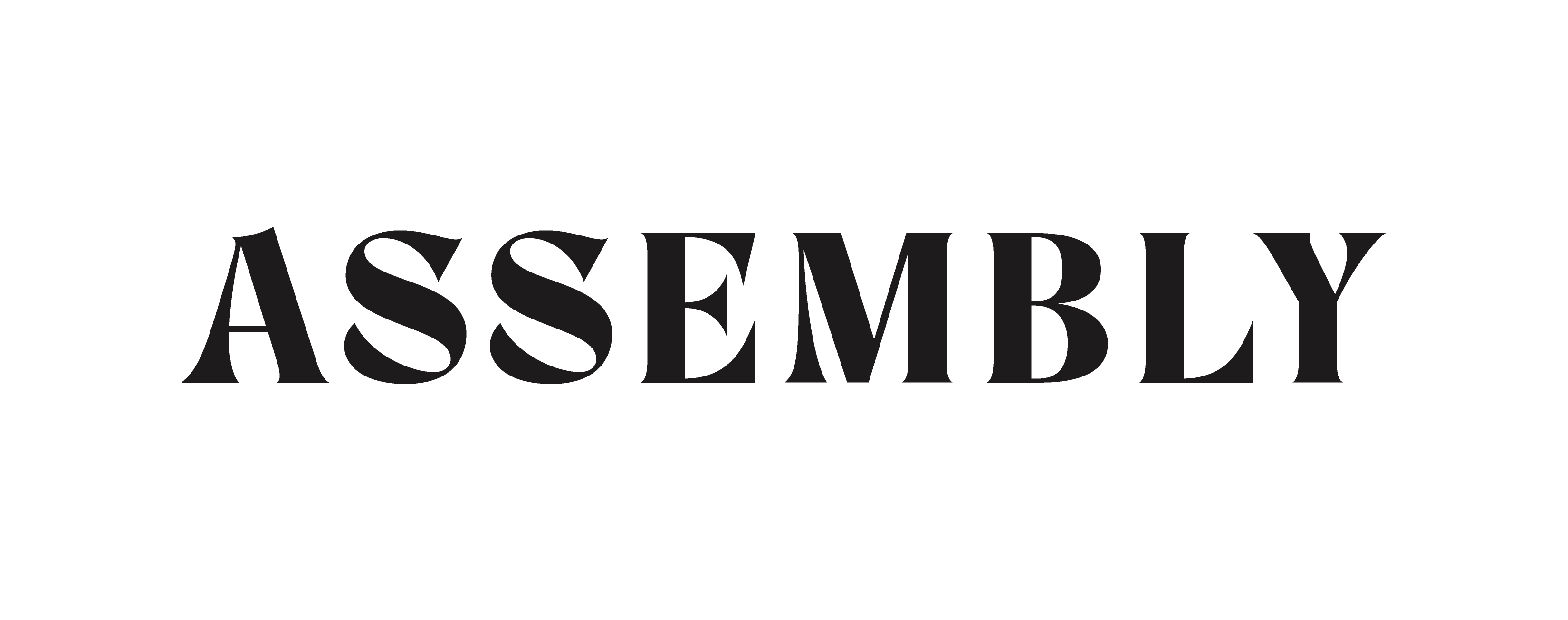
What ended up being approved was a few wordmarks for Assembly using the font Room 205. I bought Room 205 shortly after it launched, and used it for this logo—because what's not to like. But that was before it started showing up everywhere. Still, it's a great font and great mark because it's memorable, simple, and clean.

Let's work together
See more projects
