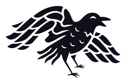
Two Gomers PodcastDate: 2023The Two Gomers asked me to rebrand their podcast because they found “Overcoming Runner’s Block” too limiting for the topics they wanted to cover. Original logo for the Two GomersFinal artworkThe process: The podcast was changing from a running podcast to a healthy lifestyle podcast. Steven asked me to create an option that utilized all of their previous podcast names. I made a few options:Option 1Option 2Option 3Option 4Option 5Option 6I really liked the illustrations with their faces because a lot of current podcast art features people, especially in the health and fitness category.Final Artwork: The Two Gomers picked this as their final artwork.Above and beyond: In addition to the final podcast art, I wanted to refresh …
Overcoming Runner’s Block
Two Gomers: Overcoming Runner’s BlockDate: 2022The Two Gomers wanted to rebrand their podcast from “Runner’s Block” to “Overcoming Runner’s Block.” You can find their podcast at twogomers.comThe Process: They had a graphic designer who was working on it previously but couldn’t complete the project. They provided me with direction they were going:Original artwork for Runner’s BlockInitial concept artwork for Runner’s BlockFirst drafts: I couldn’t get type-in-the-sky treatment to work well, and the road felt so harsh, so I made a few different options:Initial conceptOption 1Option 2Option 3Option 4Option 5Option 6Option 7The road picture on Option 5-7 was an Unsplash picture near Flagstaff, Arizona, where one of the Gomers lives.Third drafts: Eventually we narrowed it down the background, rounded the corners …
Envision Greenhouse
Envision Greenhouse LogoDate: 2022Envision Canada launched a new initiative for mentoring leaders called “Greenhouse.” I created these while working for The Alliance Canada.The Envision assembled care packages for Greenhouse members using assets I created for Greenhouse, most notably the sticker sheet. It would have had the logo on it, but we actually finalized and printed the stickers before the logo was finished.Who doesn’t love a great rubber stamp? We bought some recycled polymailers and stickers to seal it, but the team decided to stamp them to0! Apparently, the stamps took a long time to dry on the bags. Let’s work togetherName *Email Address *Phone NumberMessage *0 / 500Send MessagePlease do not fill in this field. Please do not fill in …
They Devoted Themselves
They Devoted ThemselvesDate: 2021They Devoted Themselves is a curriculum developed by Andy Lambkin from Simple Churches for house church fellowships. The name “They Devoted Themselves” comes from Acts 2:42, “They devoted themselves to the apostles’ teaching and to fellowship, to the breaking of bread and to prayer.” These four things are the “ancient rhythms” Simple Churches wanted their churches to orient themselves around.The concept I wanted create a composite image of the four ancient rhythms working together to conceptually represent the Church.Brand GuidelinesLet’s work togetherName *Email Address *Phone NumberMessage *0 / 500Send MessagePlease do not fill in this field. Please do not fill in this field. Please do not fill in this field. Please do not fill in this field. …
The Alliance Canada Rebrand
The Alliance Canada RebrandDate: 2020-2022Rebranding The Christian and Missionary Alliance as The Alliance Canada.Evolution of the rebrandThe Alliance was started in the United States by a Canadian pastor. The logomark has evolved numerous times since its inception in the 1890s. The fourfold symbol, the iconography the Alliance uses as its distinctive identity, has been established since the beginning of the movement.1890’s LogoEarly Logo, Date Unknown1960’s Logo1970’s LogoThe Canadian movement became autonomous in the 1980s when it assumed its own visual identity. The U.S. mark was rebranded in the 1990s but the Canadian mark hasn’t strayed much from the 1970s iteration.The brand I inheritedThe logo from approximately 2015-2018. The colour and text have changed over the years, but the symbol hasn’t …
Neighbourly
NeighbourlyDate: 2019The goal was to create a brand for a peer-to-peer fundraising platform for local and global causes. My team and I named it Neighbourly because we want to be good neighbours to people near and far. Created while working for The Alliance Canada.Web Designer: Matthew CaldwellCopywriter: Kristen ParkerMakeup of the markThe Neighbourly mark is symbolic of many households overlapping and becoming something bigger than the individual. The flowers represent human flourishing because we want to make the world a beautiful place together. We’ll refer to the icon as “the Neighbourhood” in this guide.Colour FormulasUse only these colours for Neighbourly applications.Picking the colour palette Research shows that women give significantly more to charities than men, so I created a colour …
Envision Summit Montreal
Envision Summit MontrealDate: 2019The goal was to create a logo for The Envision Canada event called Summit. It was an all Canadian event held in Montreal. Envision wanted to feature something that was genuinely Montreal. Previously all summit branding used a mountain asset that was shared with the sister Envision movement in the States.The original shared branding between Envision Canada and Envision USAPlaying with different type heavy badge concepts: the summit and local monuments in MontrealThese badges were axed, but we liked the reference to Mont Royal.These badges were too detailed, we were worried about losing detail when printing at sizes it was usable.This is the final version we went with, because it was easy to use as a one-colour …
General Assembly Logo
General Assembly LogoDate: 2019Every two years the Alliance has a nationwide meeting for official workers called General Assembly. Every two years we had to create a new logo and visual theme and get buy-in using all new branding. In 2020, we created a logo for Assembly that we could use for the next few General Assemblies to maintain brand awareness and spend less time getting buy-in each time. I created these while working for The Alliance Canada.Concept 1: Hand lettering. People weren’t into the A and thought the “ass” was too prominent.Concept 2: Monoline lettering. People were concerned that Millennials can’t read cursive.Concept 3: BadgesApproved ConceptWhat ended up being approved was a few wordmarks for Assembly using the font Room …

